Redstone Hotel Logo
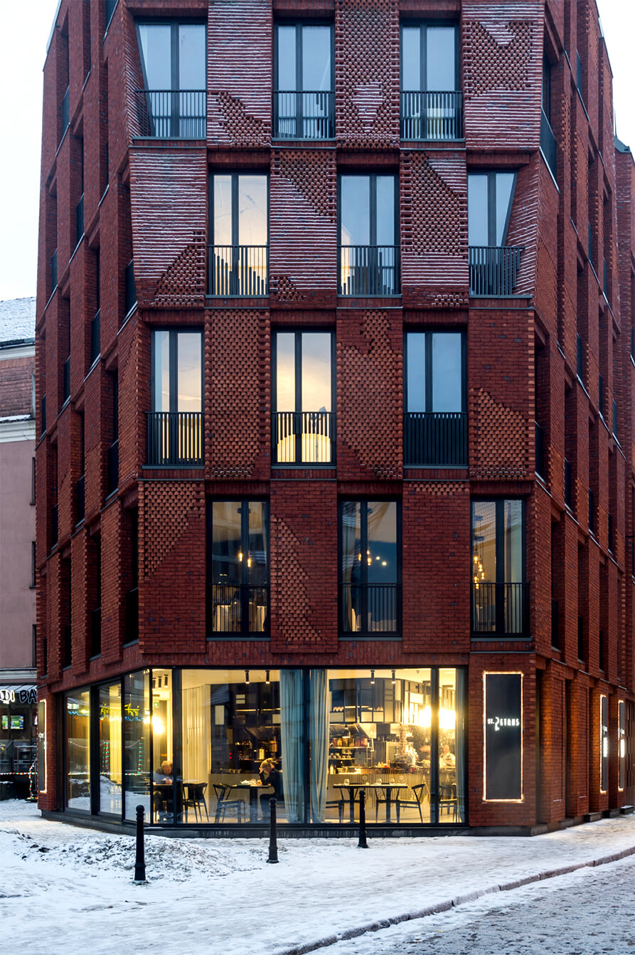
A new boutique hotel in the centre of Old Town Riga was named Redstone in honour of an unusual and colourful architectural design. Despite the fact that the building is new, it fits perfectly into the historic centre of the city. The agency has developed a logo for the new hotel.
Case
- Logo design
- Corporate identity
- Signs on the facade

The Secret
The boutique hotel Redstone has 11 rooms, which are differently designed. The sign, which is part of the Redstone inscription, hides in place of the letter N and consists of two inverted 1 digits, personifying 11 hotel rooms, house number 11 and the desire to be the first everywhere and in everything.
1
+
1
=


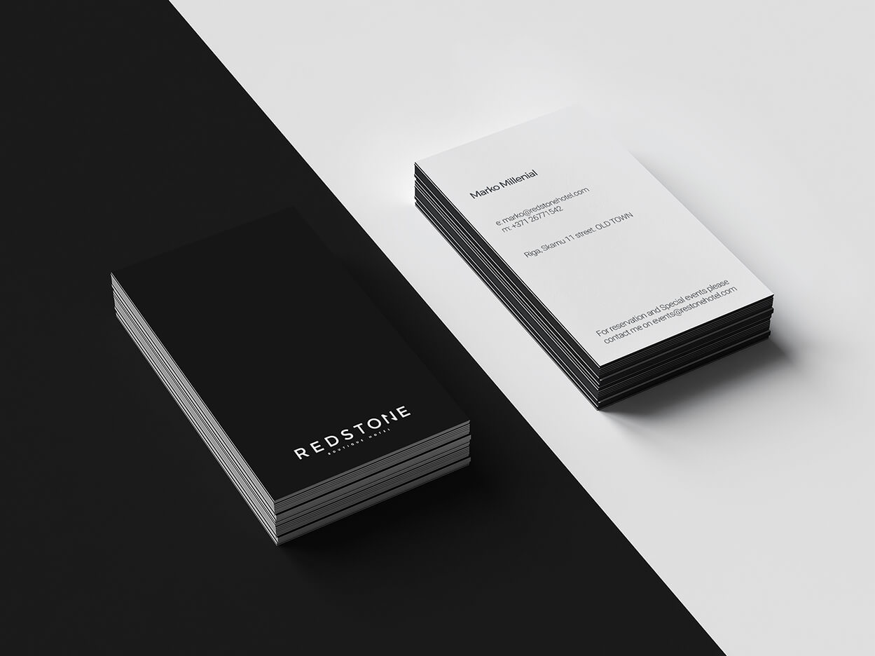
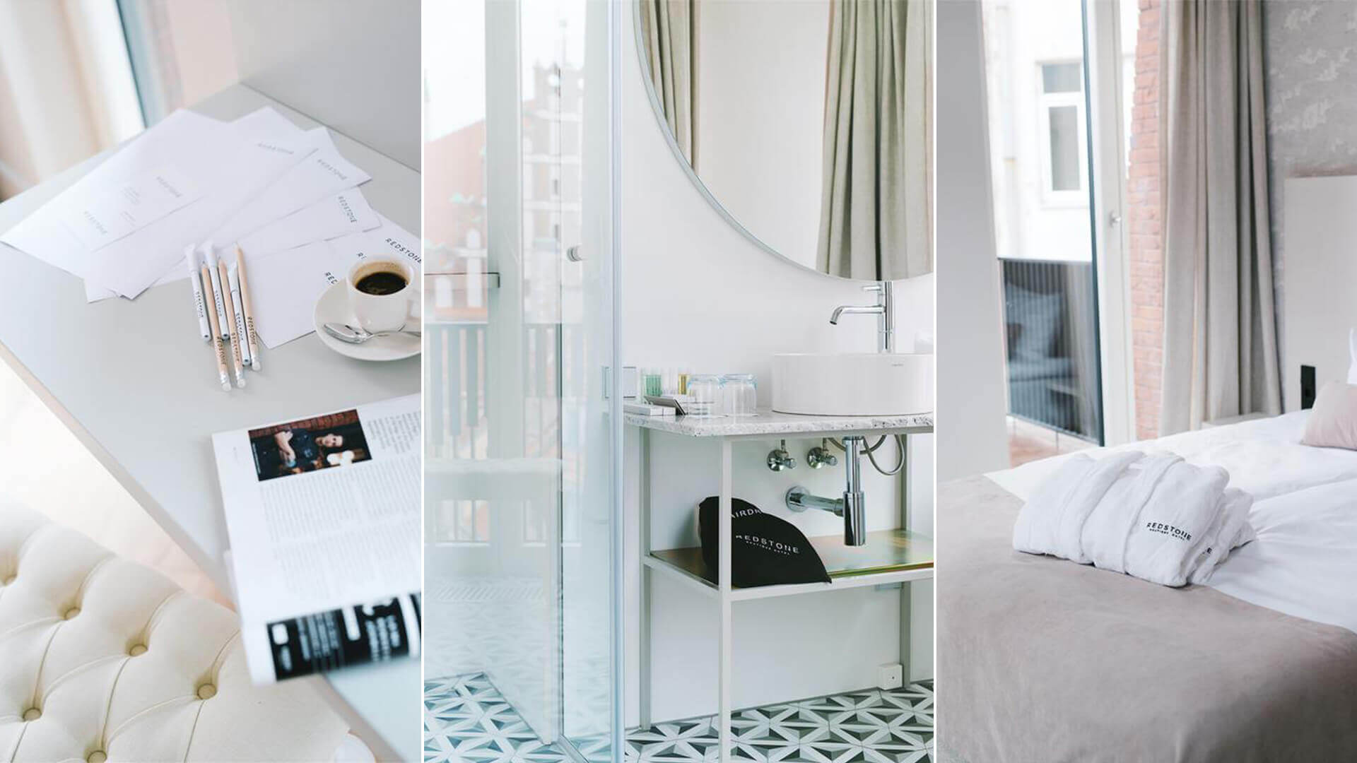
The logo is widely used in a variety of media inside the hotel.


get a quote

We love to get letters. Let's get straight to the point:


