Secret place
online-store design
The boutique showroom Secret Place specializes in unusual designer clothing from rare and single-piece brands.
The client wanted to create an unusual visual image of the store and emphasize the simplicity and elegance of the collections presented.


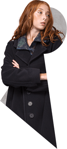
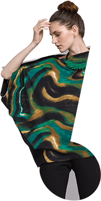
The key visual element of the design is the keyhole, borrowed from the logo. There it plays the role of the enclosed area in the letter A. In the case of the site, it became a window into the world of Secret Place.
The viewer as if peeps into a secret place through the keyhole.


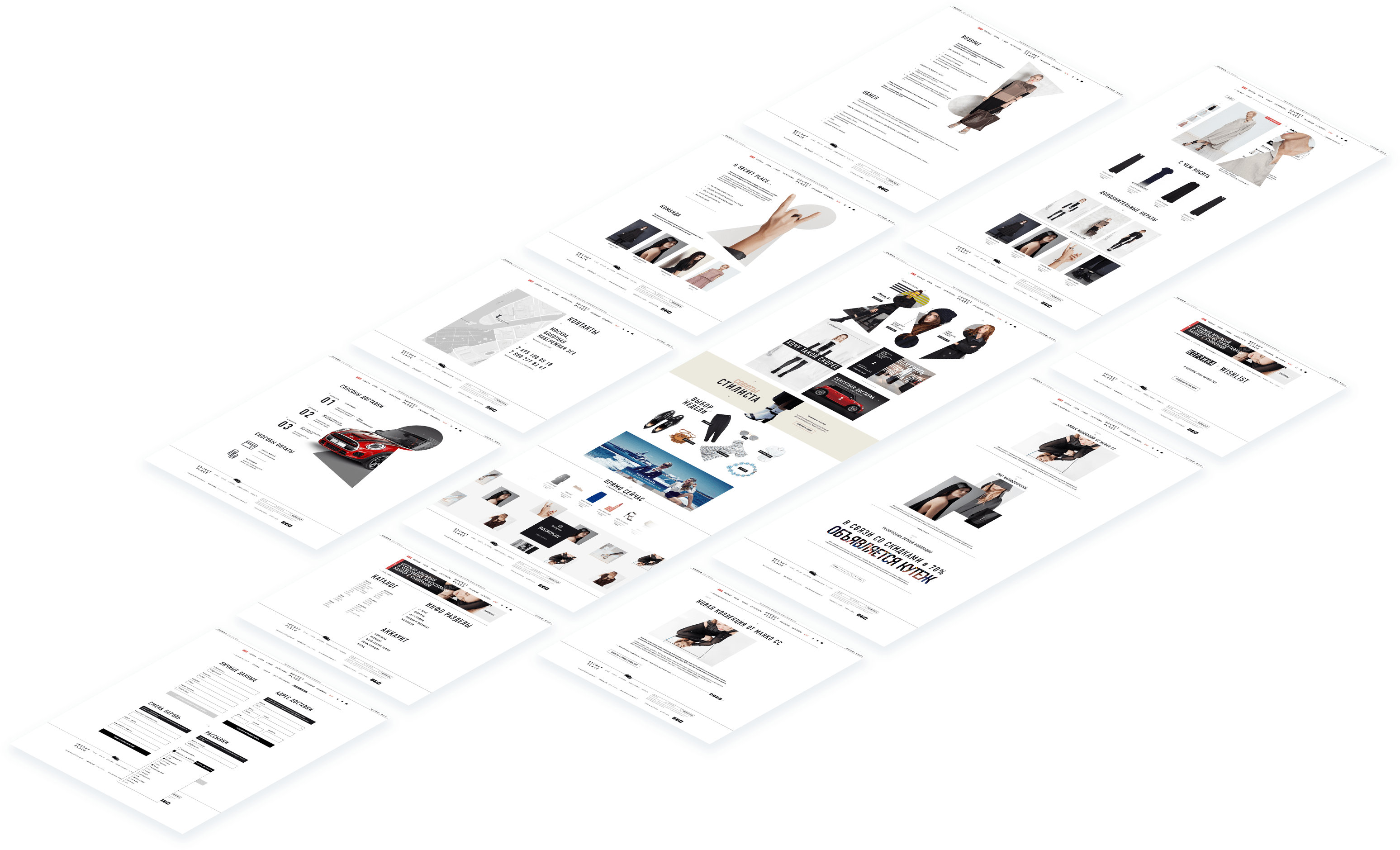
The homepage is filled with several blocks of different meaning. The attention of customers is attracted not only to online products, but also to the real showroom in the centre of Moscow.


All the main pages of the website are made in the same restrained minimalist manner. The emphasis is shifted to the products.

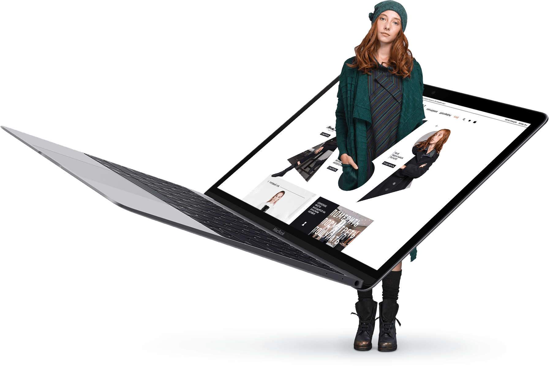
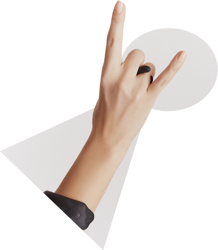
We have created graphic elements that would give the design additional depth and multi-level effect.
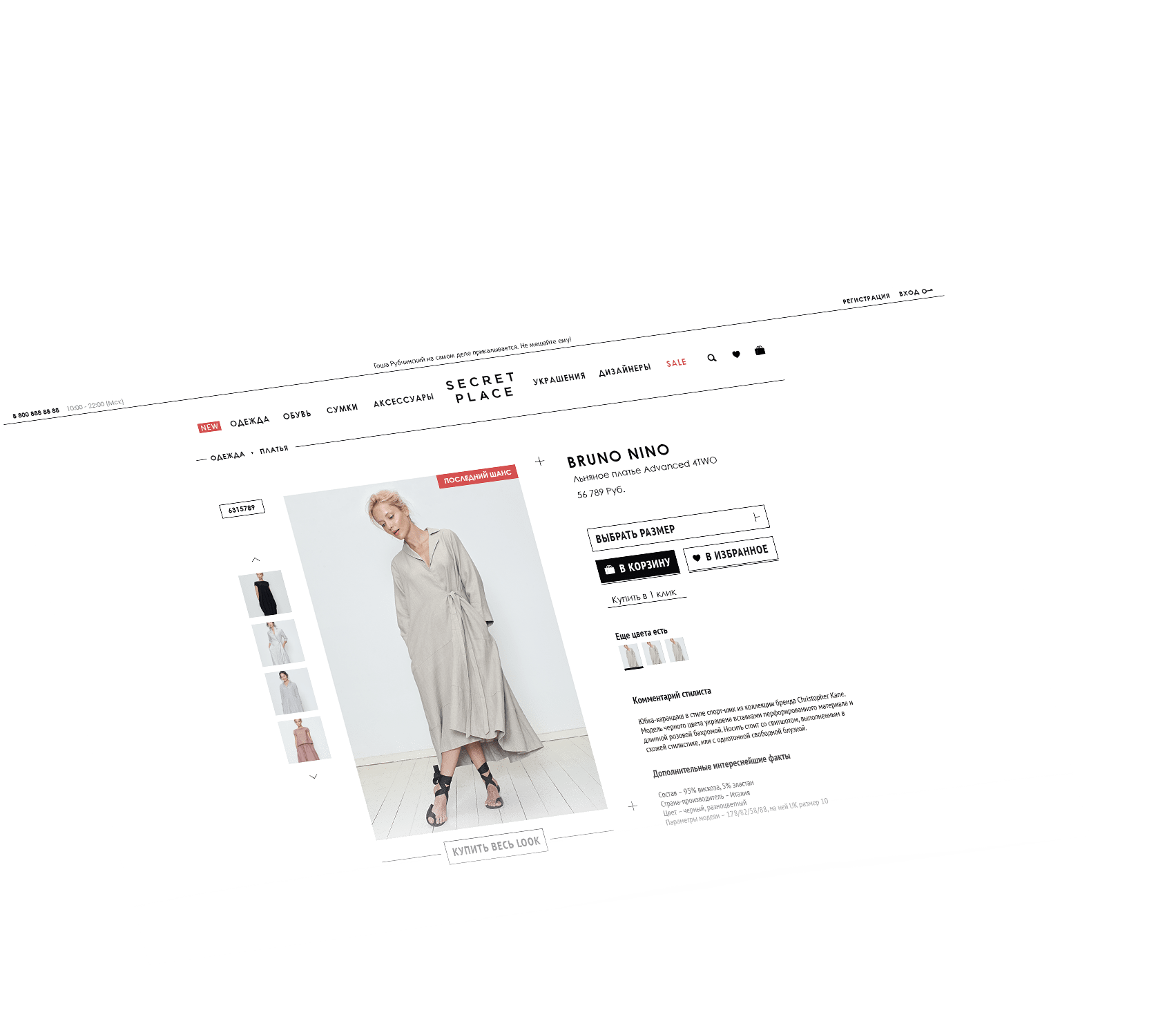
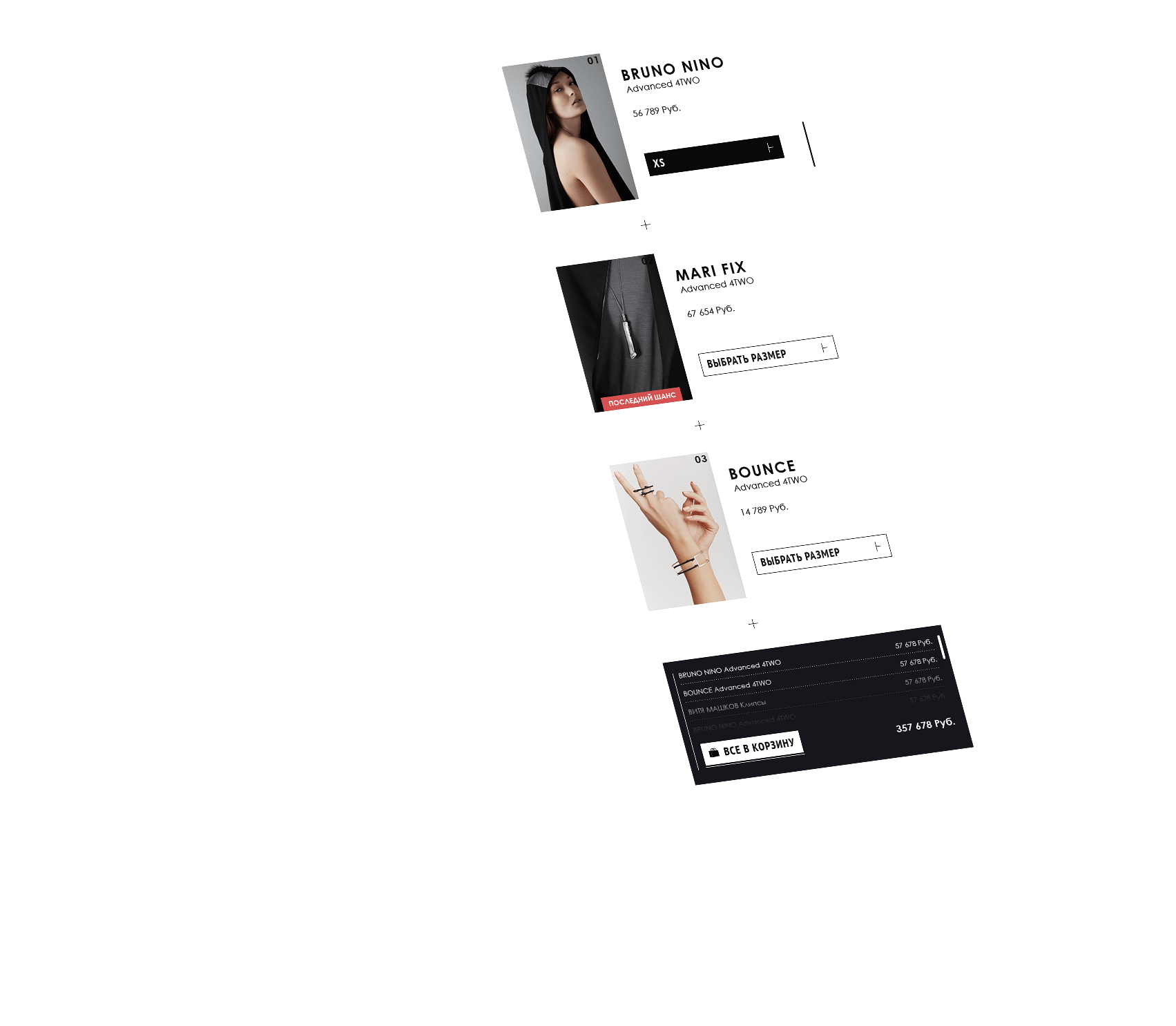

Buy the whole look.
Each product has an option to buy an whole look, which is shown in the photo gallery of a particular product.
get a quote

We love to get letters. Let's get straight to the point:


