
Aizkulises website
A new stylish development project was built on Aleksandra Čaka street 134, in Riga. The facade of the house decorated in a unique way. The project's architects were inspired by a design pattern of the curtain of the Latvian National Opera, which became the hallmark of the new building.
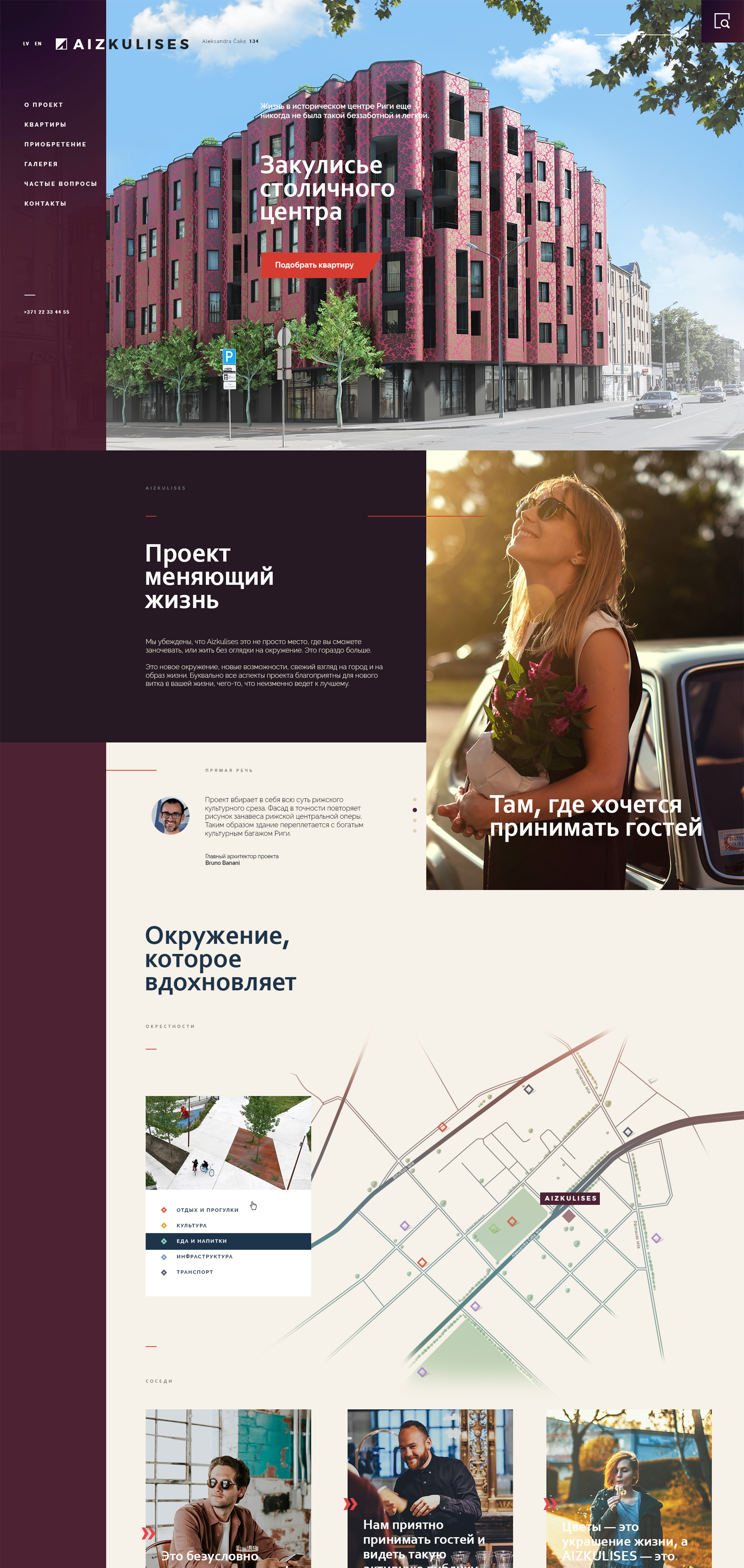


GOAL
Our goal was to create a bright, modern and stylish website that explained the buyers about all the most important aspects of the new project.

CASE
We created a website project, designed a logo, wrote texts and took photos for the design of the website pages and other marketing materials.
- Logo design
- Website development
- Copywriting
- Photo shooting




Responsive web design — important component of the sales process.
To enable users to find out the necessary information at any time is a key factor in making such a responsible decision as buying an apartment.
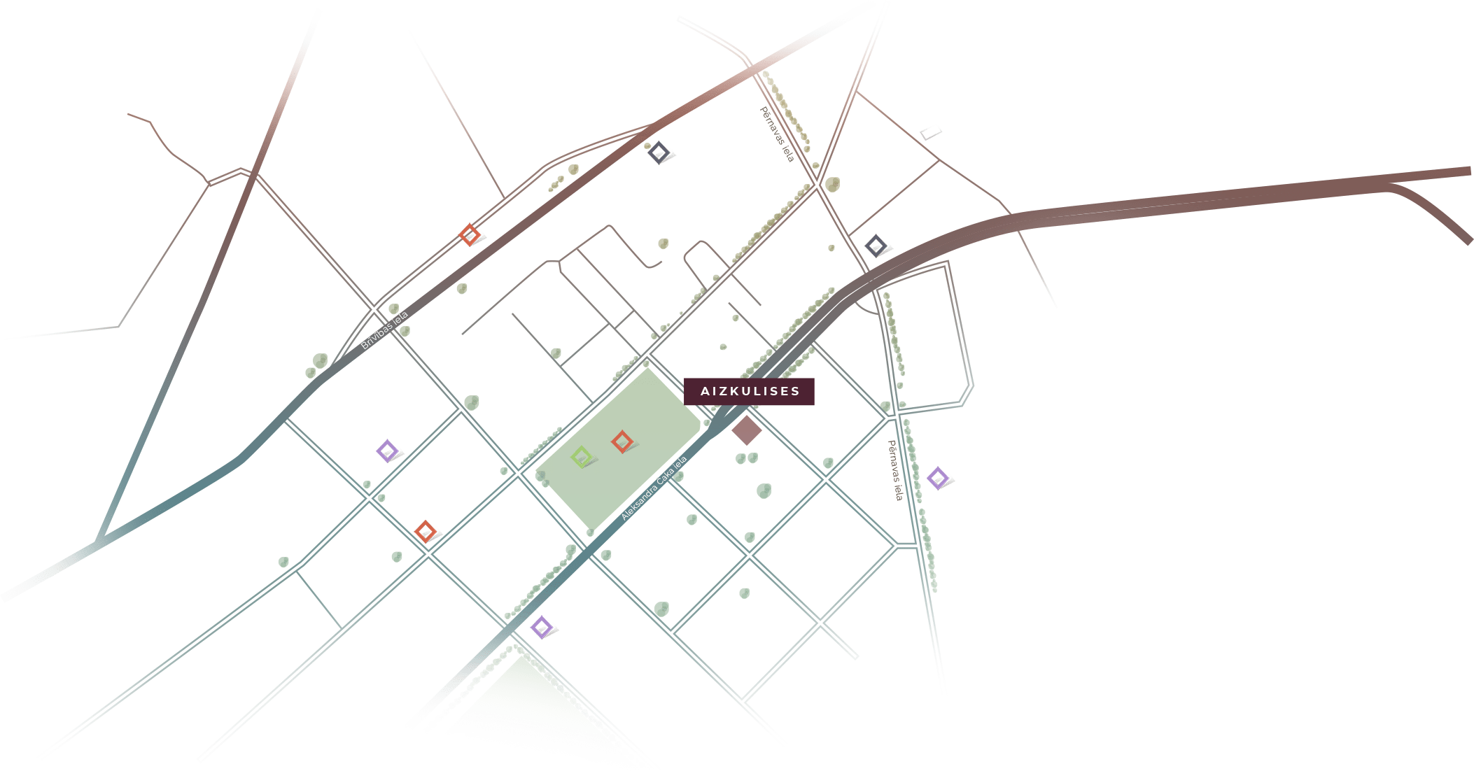
MAP
Infrastructure is an important part of the living environment. For the website, we created a map indicating all the main objects around the Aizkulises project.
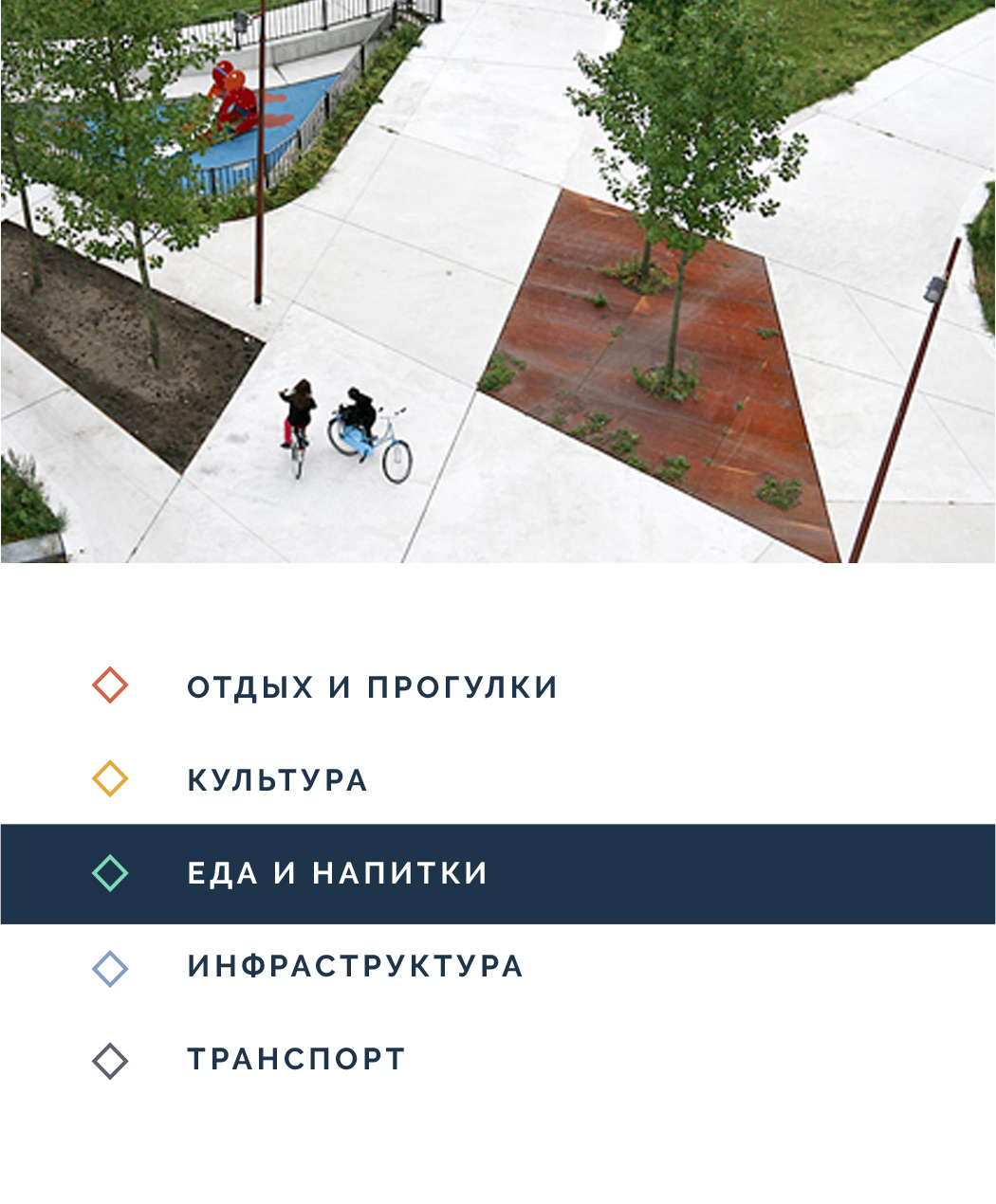
PHOTOSET
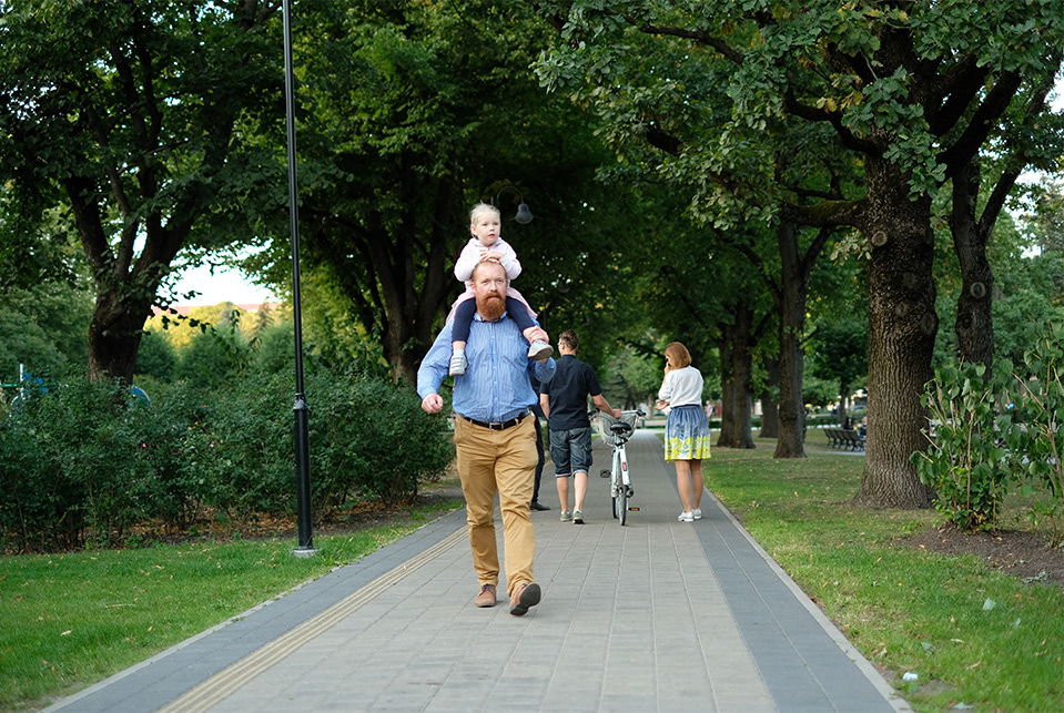
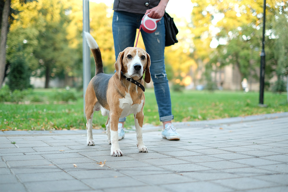
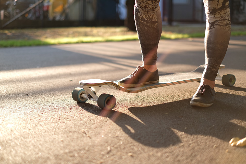
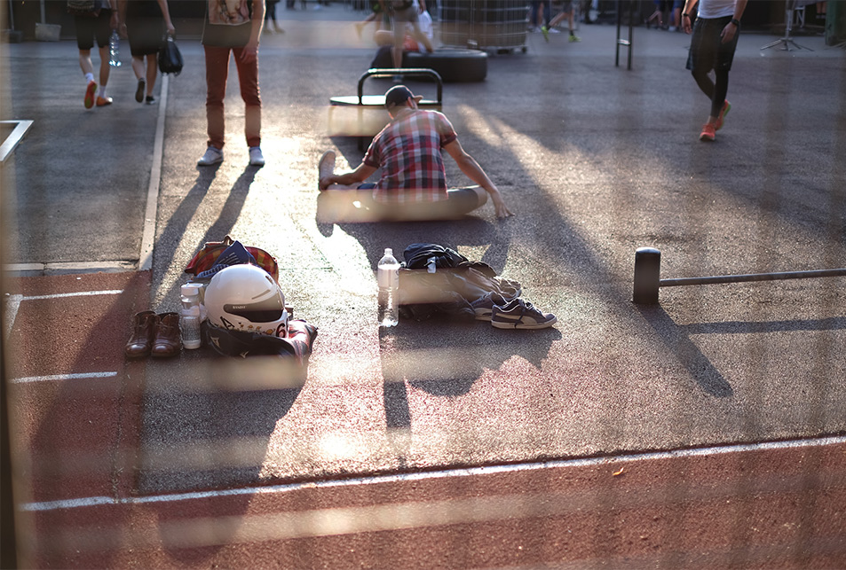
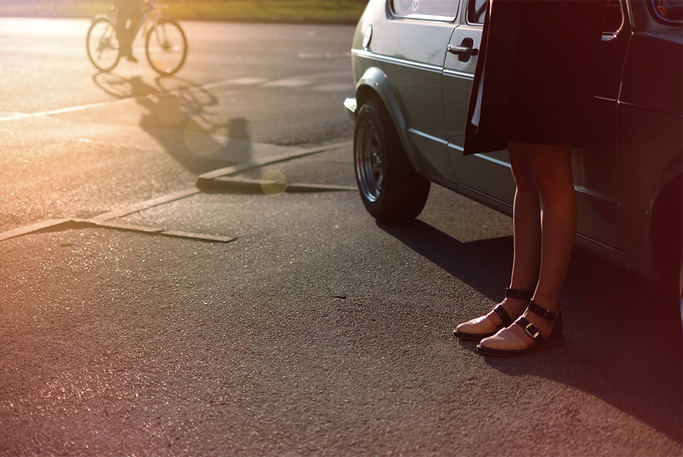
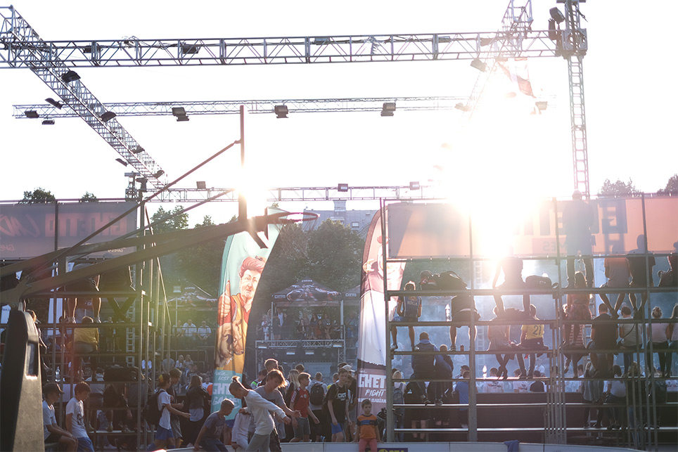
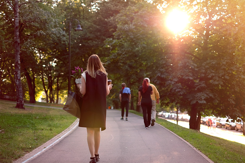
To create the right atmosphere, we didn’t use stock photos but made a photowalk. It turned out that a lot of interesting things are happening nearby.





LAYOUTS
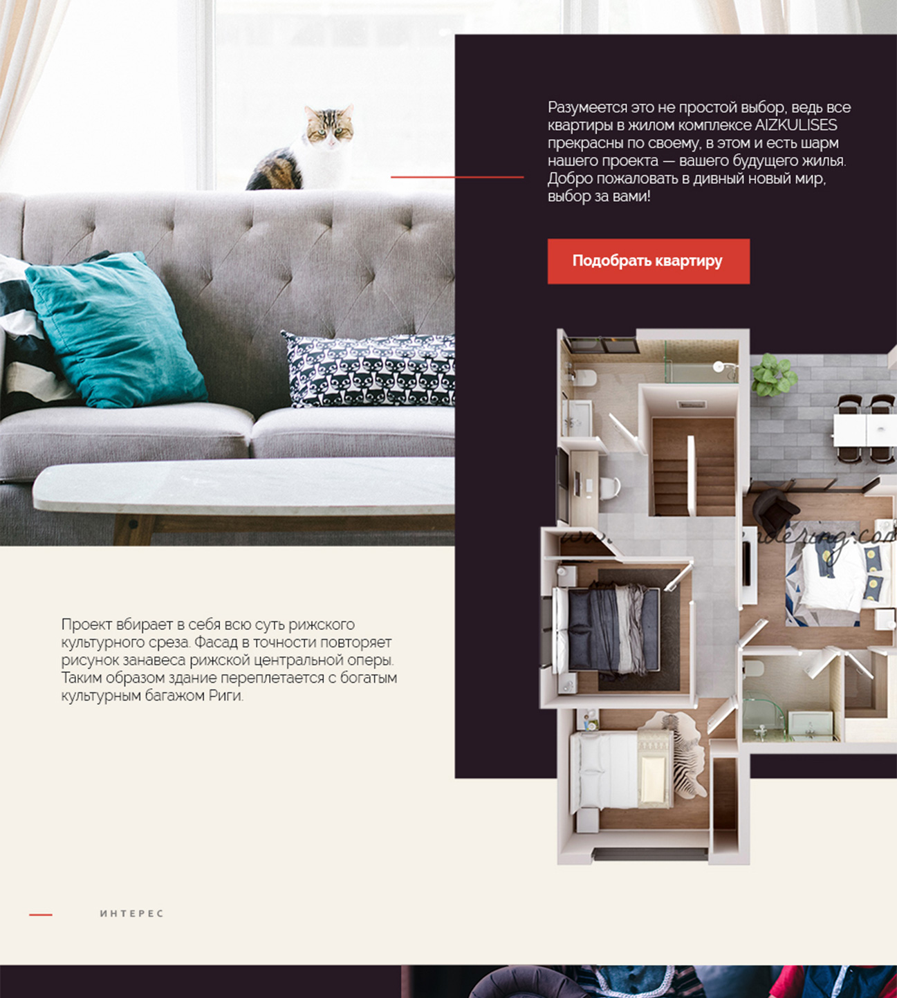
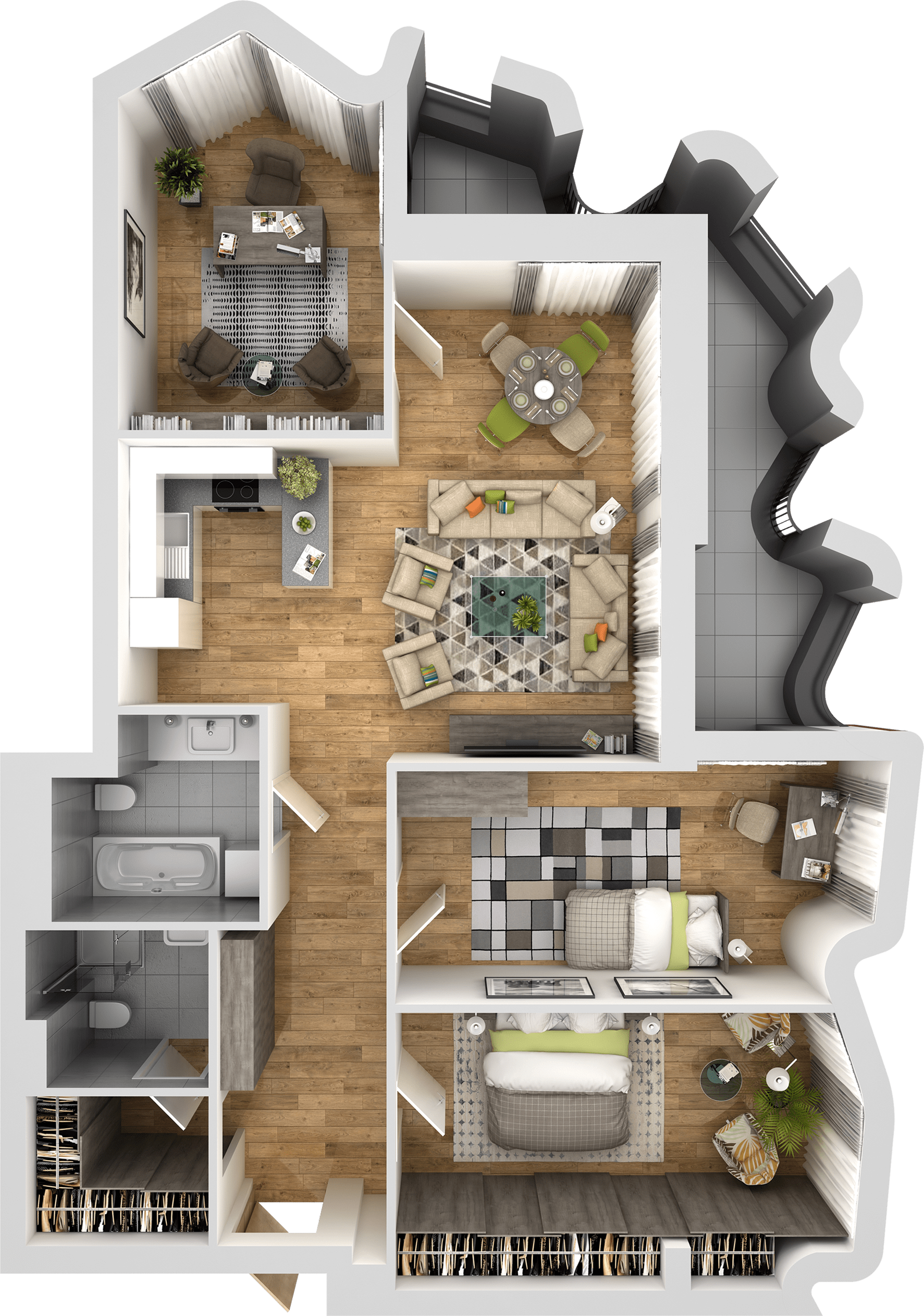
Each apartment on the website is provided with an illustration of its layout so that buyers can more easily imagine the size of the apartment and an approximate image of the future housing.

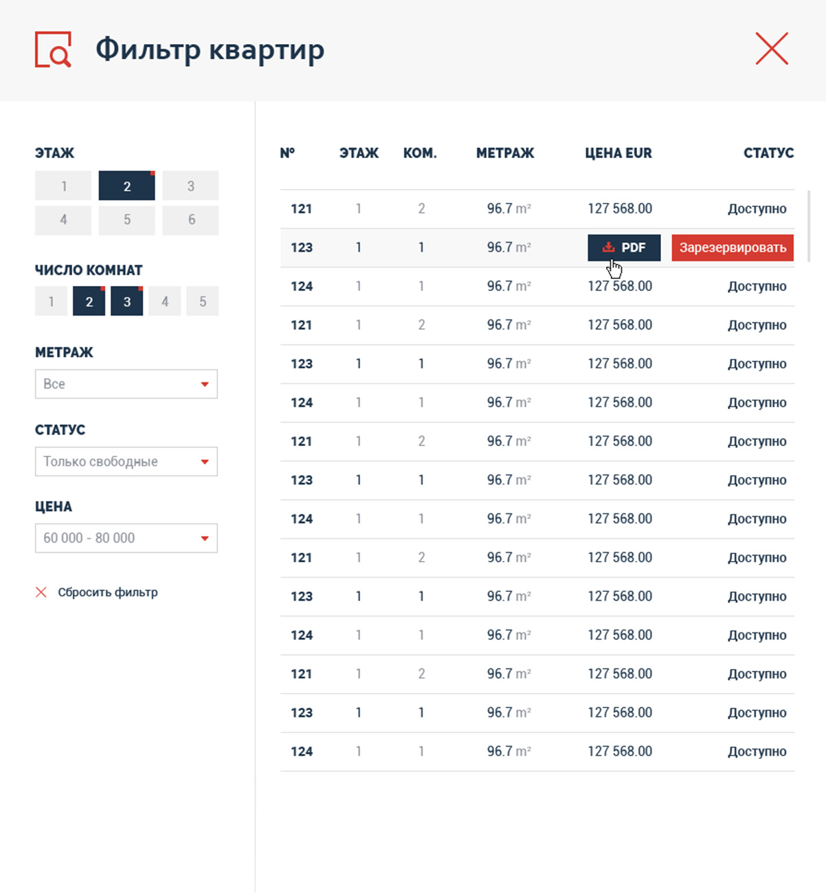
Selection is made using a convenient filter located on top of all the pages of the website.
PAGES
All the necessary information is placed on a few pages. We were guided by the consideration that the user should receive only the most important data as fast as possible.


The design of each page of the website is unique and filled with nice details and beautiful photos.


